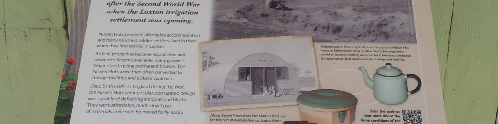
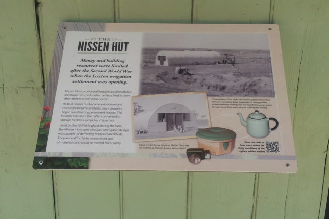
This sign interprets the uses of the Nissen Hut over time. The contrast of dark text on a light background makes the text quite readable, and the use of light coloured space around the text aids the uncluttered feeling. Text is simple and decorative effects are used sparingly. The larger heading immediately draws attention to the theme and a key message is shown directly under the heading. Artefacts connected with the building are reproduced on the interpretive panel rather than having them take up shelf space, and aesthetically match the colours of the building in the background and colours used on the sign. Images of the Hut in its contemporary setting provide additional context rather than using heavy blocks of text to describe it. It is not always possible to include everything known about an object on an interpretive panel and QR codes (bottom right hand corner) are an excellent way of providing access to additional information for interested audiences. The Village, Loxton. Photograph by History Trust of South Australia.